Supported components
The overview of all available components in Portal template and guides how to use them.
Text
The Portal template offers a collection of pre-styled Markdown typography elements to help you create a well-structured document.
| Style | Markdown syntax | Alternative syntax |
|---|---|---|
Heading 1 | # Heading 1 | |
Heading 2 | ## Heading 2 | Heading 2 --------- |
Heading 3 | ### Heading 3 | |
Heading 4 | #### Heading 4 | |
Heading 5 | ##### Heading 5 | |
Heading 6 | ###### Heading 6 | |
| Plain text | Plain text | |
| Bold text | **Bold text** | __Bold text__ |
| Italic text | *Italic text* | _Italic text_ |
Inline code text | `Inline code` | |
| Text link | [Text link](url) |
H1 - H6 headings inside the table are not supported by the markdown. The example above is using HTML tags instead.
List
Lists are a great way to organize information in a structured manner. They can be used to present a series of items, steps, or bullet points in a clear and concise way.
Numbered List
- Cook pasta
- Add tomatoes
- Toss pasta with sauce
1. Cook pasta
2. Add tomatoes
3. Toss pasta with sauce
Bulleted List
- Classic spaghetti with tomato basil
- Penne with creamy pesto
- Fusilli with garlic and olive oil
- Classic spaghetti with tomato basil
- Penne with creamy pesto
- Fusilli with garlic and olive oilCallout
Callout elements are meant to draw attention to important information or provide additional context to the user.
The note callout is a subtle callout used to provide supplementary information or tips. It helps users gain additional insights without distracting from the main content.
<Callout variant="note" title="Note">...</Callout>The info callout is a blue callout designed to capture more attention from the user than a simple note. It highlights important information that users should be aware of.
<Callout variant="info" title="Info">...</Callout>The tip callout is used to offer helpful advice or recommendations. It provides users with useful suggestions or shortcuts that can enhance their experience.
<Callout variant="tip" title="Tip">...</Callout>The warning callout is an orange callout used to alert users about potential issues or cautionary details. It draws attention to situations that require careful consideration.
<Callout variant="warning" title="Warning">...</Callout>The danger callout is a red callout intended to warn users of critical errors or urgent issues. Its striking appearance ensures users address these problems immediately.
<Callout variant="danger" title="Danger">...</Callout>Code block
You can add code blocks using a jazzed-up markdown syntax like this:
```js showLineNumbers title="Code block title"
const x = "Hello world"
```
You can also use React Syntax for code blocks like this:
<CodeBlock language="js" title="Code block title" showLineNumbers>
    {`const x = "Hello world"`}
</CodeBlock>
Code block without a title will look like this:
const x = "Code block without a title"Image
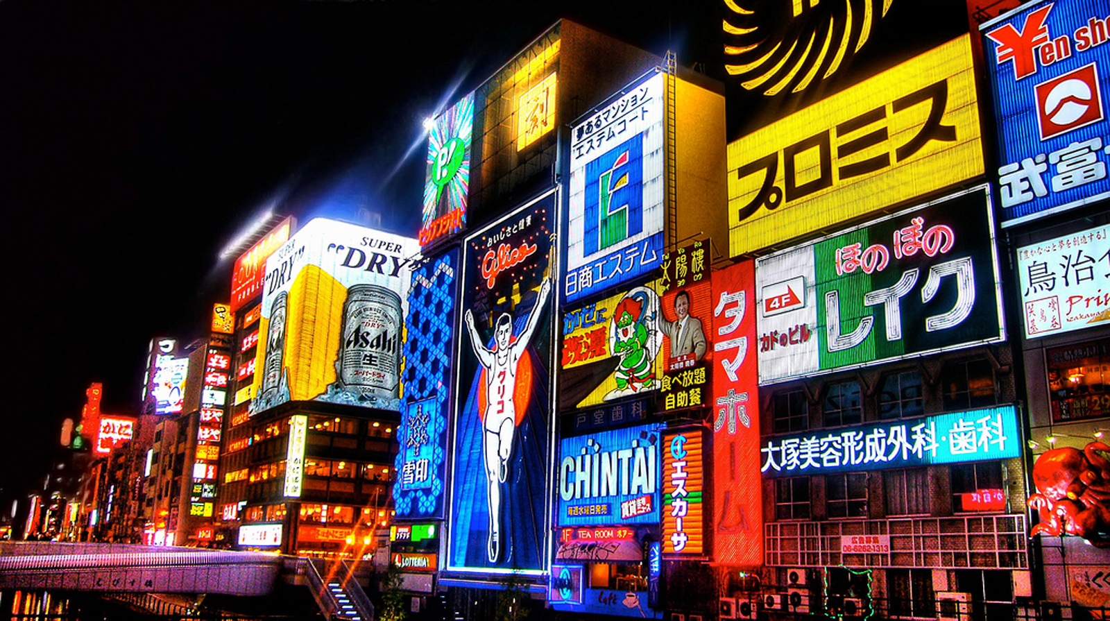
Here's an image with a simple markdown syntax and an image from the /public/img folder. This will be converted to a next/image with all its benefits.

Images with external URL
Here's an image with a simple markdown syntax, but an image from the web. Since we don't know the width of the image, we can't use next/image, this will be converted into a simple img tag.
HTML image tag
You can also use the Image JSX tag to add images
<Image src="/img/demo-image.png" alt="Abstract art"/>Image size
This way you can adjust the width of the image
<Image width={400} src="/img/demo-image-03.png" alt="Abstract art"/>
Alignment and caption
Wrap your image with Frame component to control the alignment and add a caption. In HTML it's rendered as a figure tag.
<Frame align="center" caption="Center aligned image">
   <Image width={300} src="/img/demo-image-01.png" alt="Abstract art"/>
</Frame>


SVG
Use svg images as you would use normal images.
<Frame align="center">
  <Image width={800} height={450} src="/img/demo-image.svg" alt="Abstract art"/>
</Frame>
Inline image
If you use the Image tag or the markdown syntax for images outside the frame -- you're adding an inline image.
Here's an example <Image src="/img/demo-inline-image.svg" width={100} alt="Abstract art" /> of an image embedded within a paragraph.Here's an example  of an image embedded within a paragraph.
Here's an example  of an image embedded within a paragraph.Here's an example of an image embedded within a paragraph.
What's missing for images
- Review/research the blur property
- Limit next image sizes to max width of container?
Frame
When you need to make an image as a block element or control its alignment. Use the Frame component for that. In HTML it's rendered as a figure tag.
<Frame caption="Caption text goes here" align="center">
   ...
</Frame>
The frame component supports any content inside it, not just images. For example, you can wrap tables or your own React elements. caption prop is a string, and align prop allows three possible values: 'left', 'center', and 'right'.
Table
Tables can be represented with the GFM syntax
| Rocket               | Height   | Payload to LEO | Stages |
|:---------------------|:--------:|:--------------:|:------:|
| SpaceX Starship      | 120 m    | 150 t          | 2      |
| NASA SLS Block 1     | 98 m     | 95 t           | 2      |
| Blue Origin New Glenn| 98 m | 45 t | 2 || Rocket | Height | Payload to LEO | Stages |
|---|---|---|---|
| SpaceX Starship | 120 m | 150 t | 2 |
| NASA SLS Block 1 | 98 m | 95 t | 2 |
| Blue Origin New Glenn | 98 m | 45 t | 2 |
Center and add a caption on a table
You can also wrap a table inside a frame to align it and add a caption.
| Rocket | Height | Payload to LEO | Stages |
|---|---|---|---|
| SpaceX Starship | 120 m | 150 t | 2 |
| NASA SLS Block 1 | 98 m | 95 t | 2 |
| Blue Origin New Glenn | 98 m | 45 t | 2 |
Here's how to do it.
<Frame align="center" caption="Table inside a frame with a caption">
| Rocket               | Height   | Payload to LEO | Stages |
|:---------------------|:--------:|:--------------:|:------:|
| SpaceX Starship      | 120 m    | 150 t          | 2      |
| NASA SLS Block 1     | 98 m     | 95 t           | 2      |
| Blue Origin New Glenn| 98 m     | 45 t           | 2      |
</Frame>